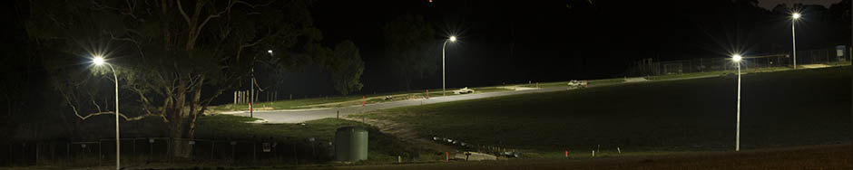
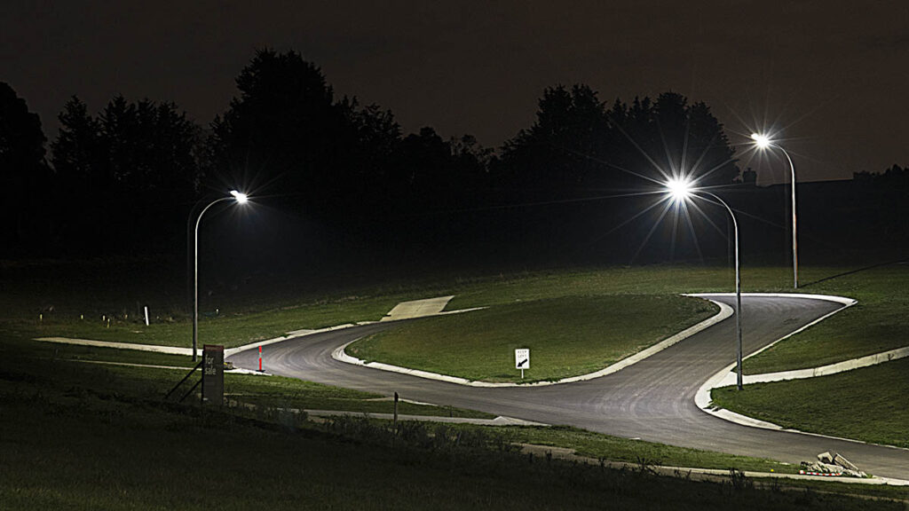
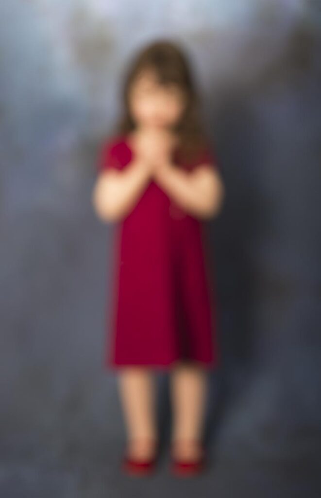
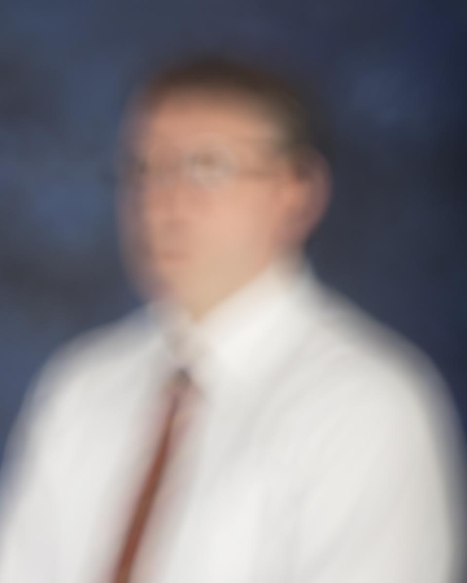
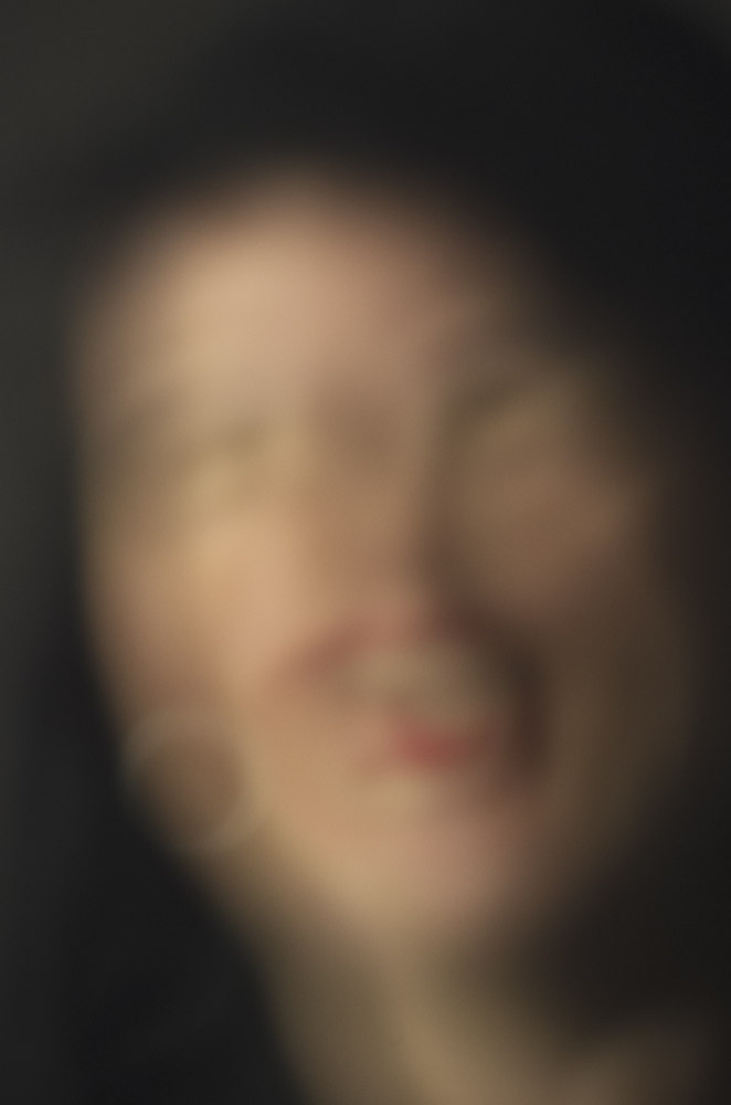
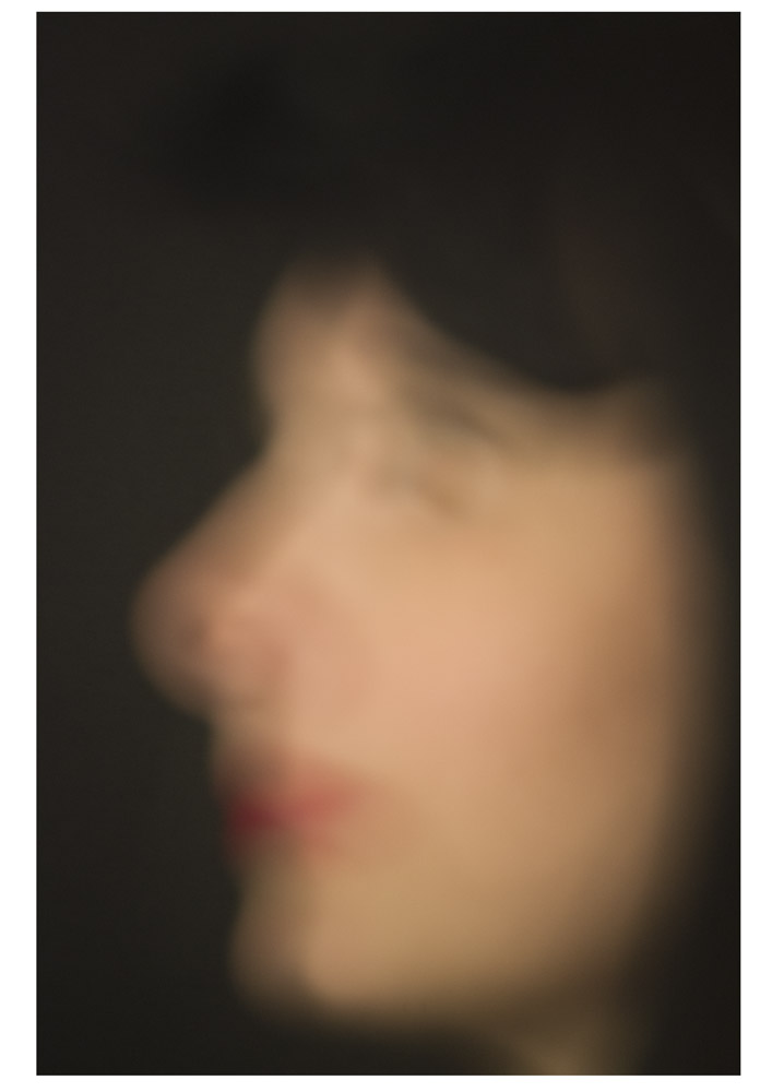
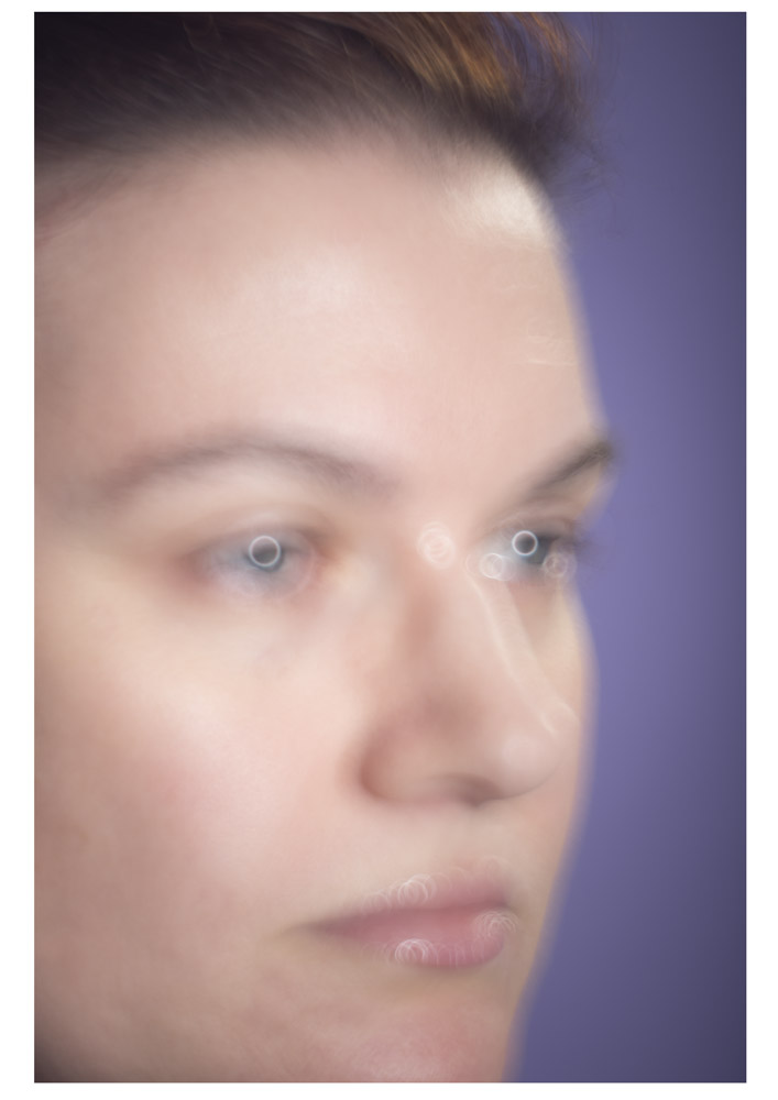
There is a serenity to shooting at night, when there is nobody there to annoy you and life has slowed down a bit and you have a chance to breathe. The colours of night are different too, with long exposures and artificial lighting giving results that challenge your expectations of what a place looks like. The places where I shoot are usually drab and ordinary by day, but when they empty out at night the space becomes more interesting as you focus more on the few details that are left.
At 2:45pm I had the external assessment of the final folio for the Art Major. I think I am now officially no longer a student, at least until I sign up to do the Bachelor Degree pathway program next July. There were nerves beforehand but it all went very smoothly and was over before I knew it. A year’s work talked about and summarised in twenty minutes. I had five framed images in the exhibition and another seven loose on a table for the assessors to look at. The choice of framed images was partly down to the fact that not everything was finished when I had to send the prints off to the framers, but there were also a few that various people had responded to strongly.
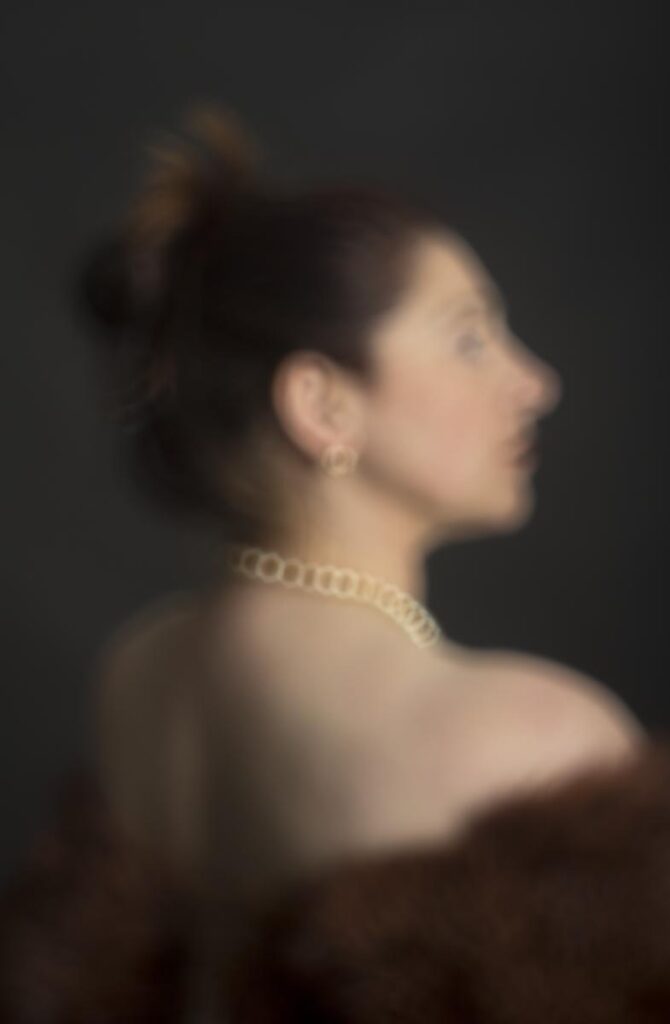
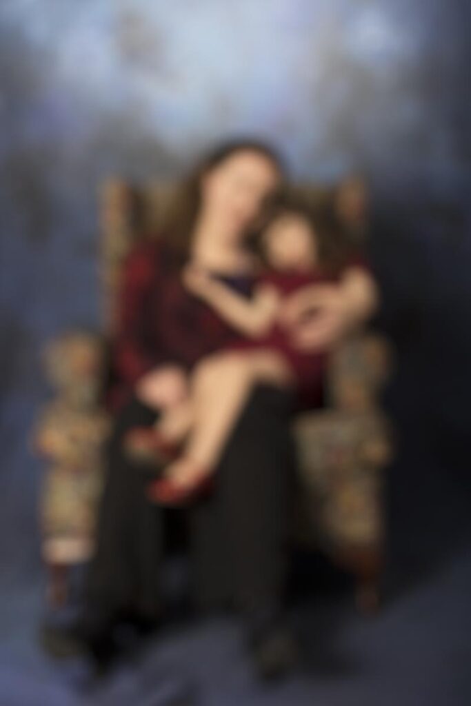
Well, we’re a month out from our final folio presentation and I’m sort of on track. The artist’s statement still isn’t finalised and I’m still shooting people as often as I can schedule them but I now have a small pool of pictures that might be good enough for the final cut. I’m getting better at judging the degree of blur I want but it is still hard to judge in the viewfinder so I’m bracketing madly as I go. Thank goodness for the patience of my models. There is still some debate about how large I should be printing and what the correct viewing distance will be (which will affect where in the gallery they are displayed). Fortunately the latest thinking has scaled back from a wallet bursting life-size (around $200 for a 180cm long print) to maybe A2 which I can manage on my own printer.
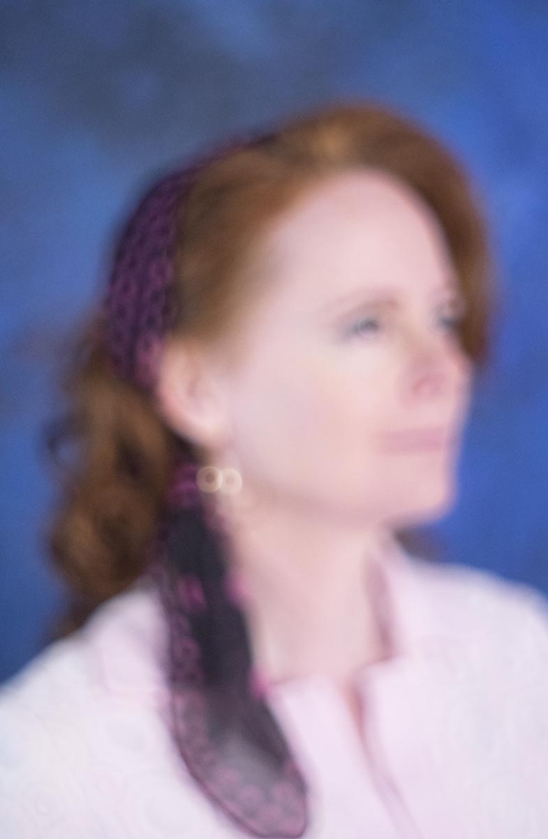
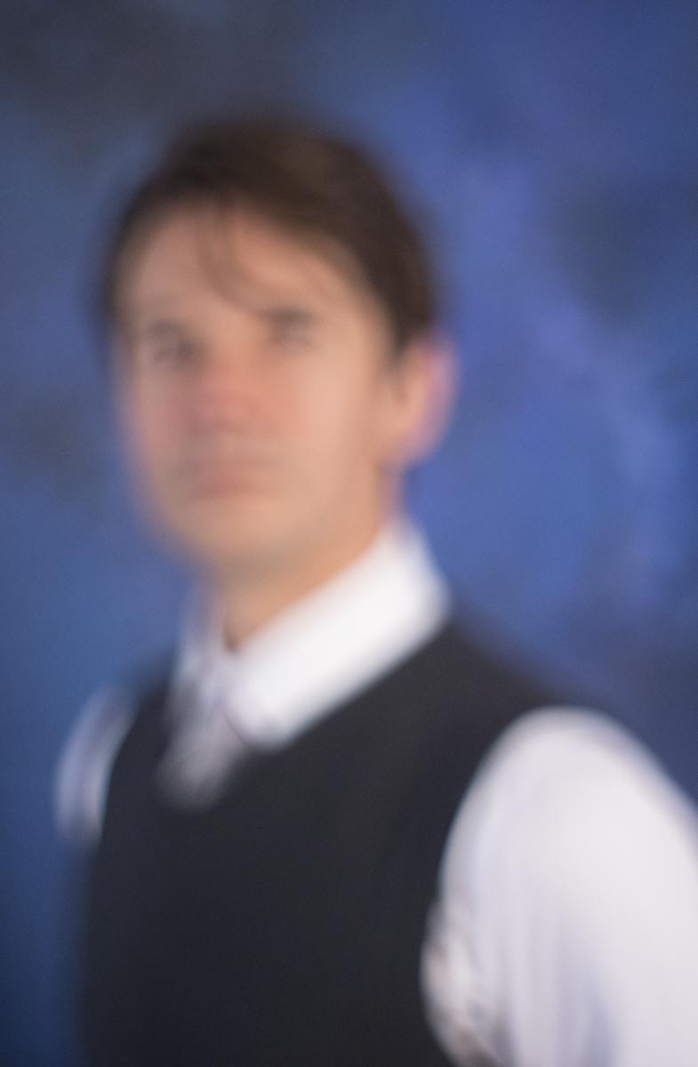
I’ve now got a second option for KRin
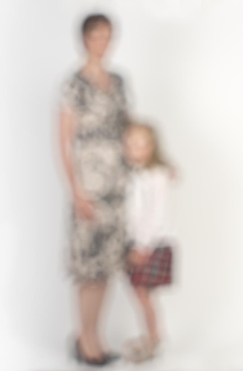
Two of Alison and Ashleigh
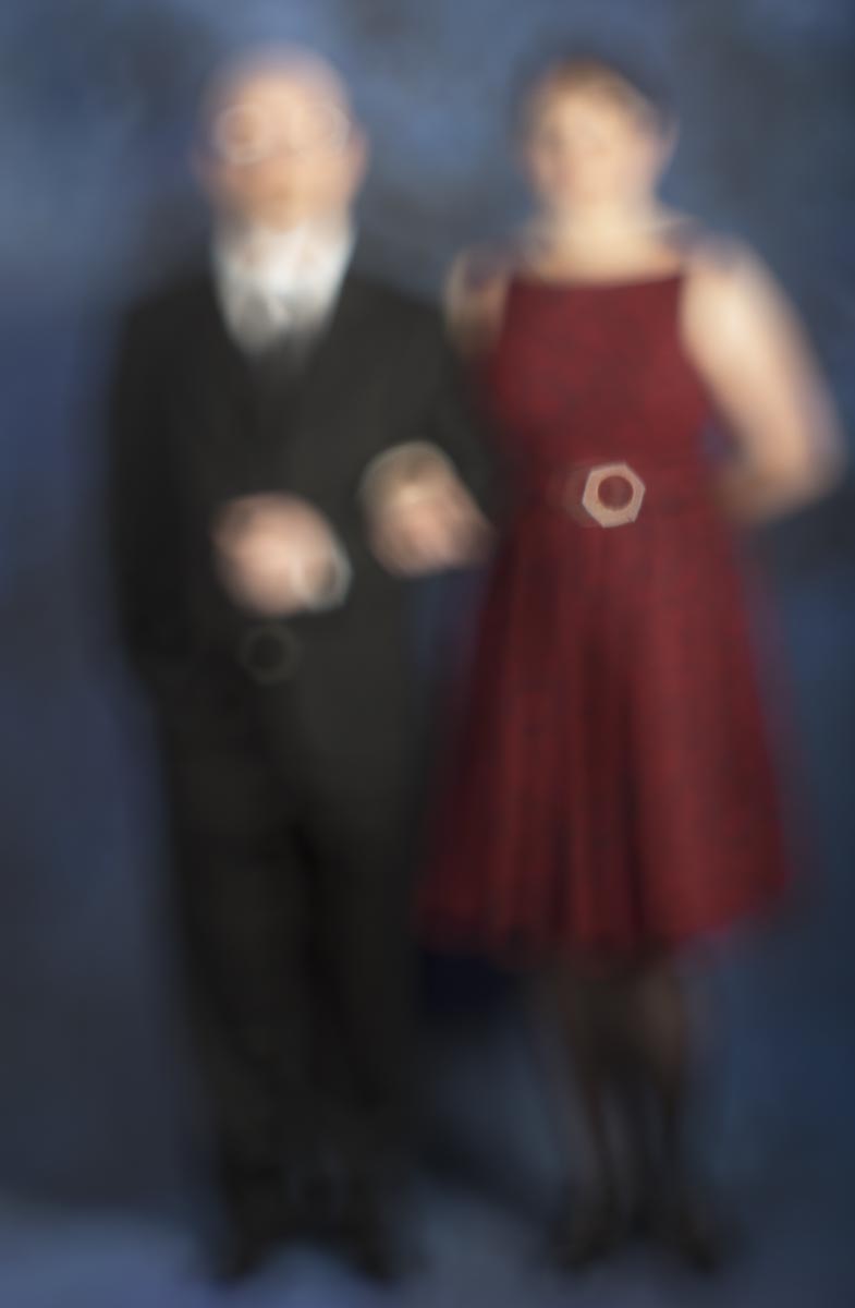
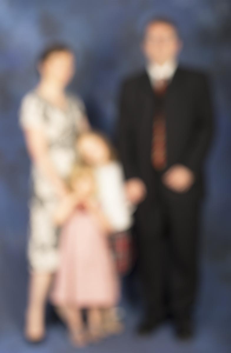
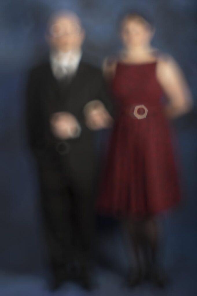
And three to choose from for Michael and Karen. I hope to be able to use the last two as a facing pair, either framed as a diptych or separately.
We are getting rapidly closer to the end of the semester and the end of the course and the number of different things to think about is multiplying. We’ve just had a mini review of where everyone is up to and this included a draft artist’s statement. The purpose of the statement is to help people understand what our work is all about while still leaving room for people to make their own connections. I had expected this to be really difficult, but in fact it came together quickly and relatively painlessly. Naturally the first few drafts aren’t quite there yet as there is a lot of editing and finessing to get it just right. The thing that surprised me is how helpful it was to have to write one. Because I was spending time thinking about how to describe my work I naturally ended up thinking more about the work itself so the whole process helped to clarify exactly what I was doing and why.
The other part of the review was looking at new work. In the intervening couple of months we had moved house and are just about to put the old house on the market so there hasn’t been much time for actual photography. A quick shout out got help from friends and three shoots were done in a couple of days.
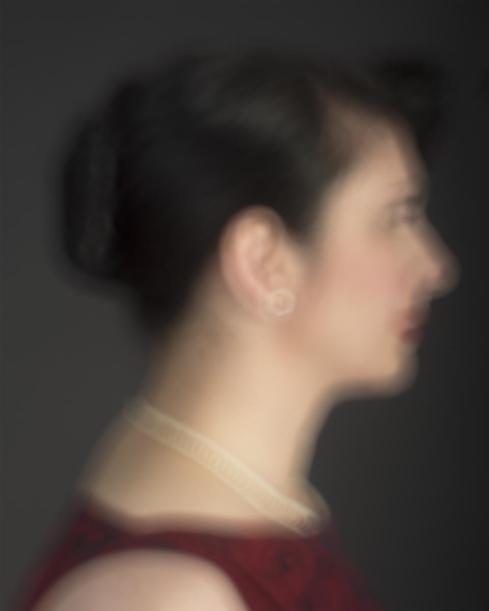
Thanks to KRin:
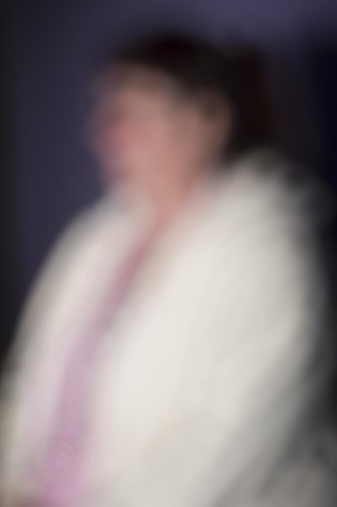
and Marina:
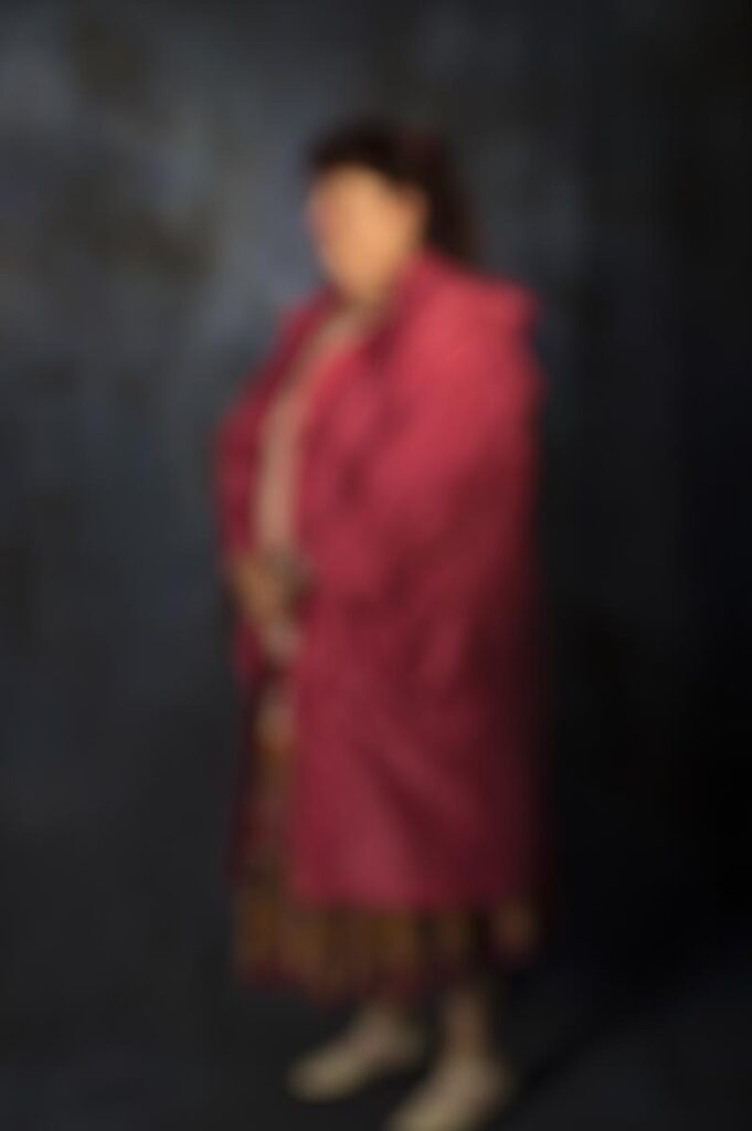
and lastly Jane:
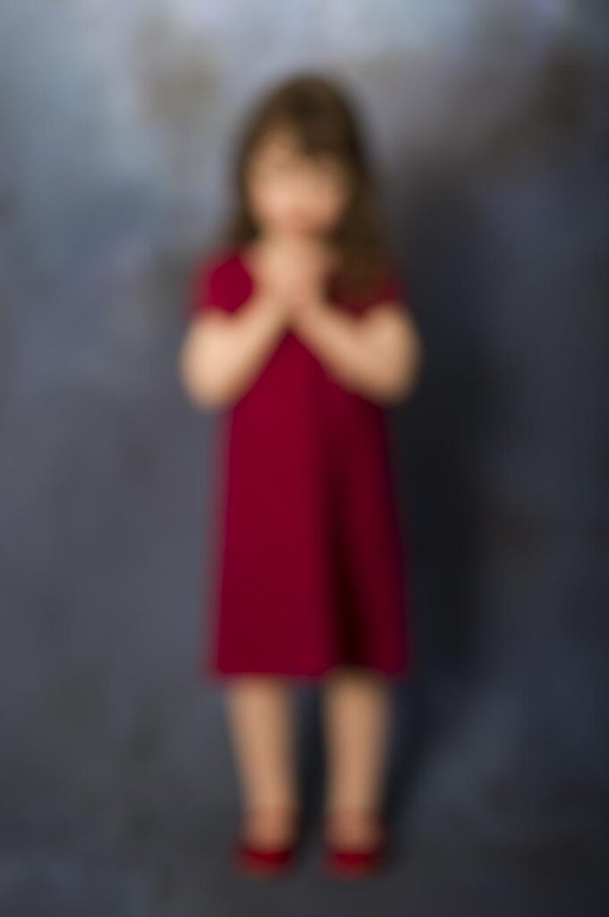
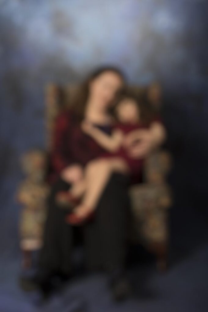
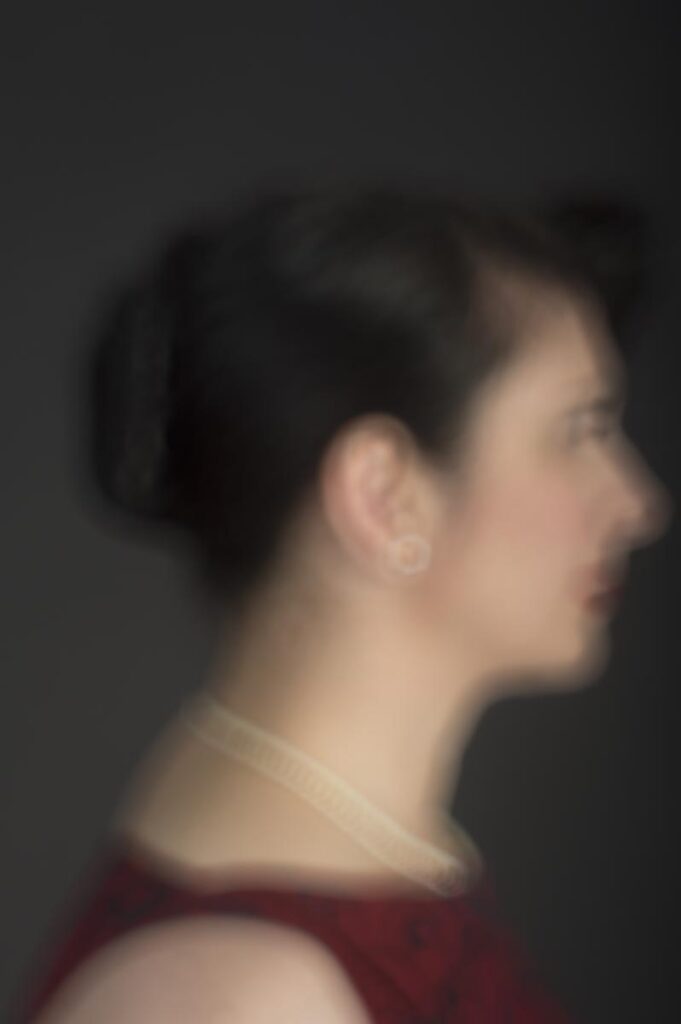
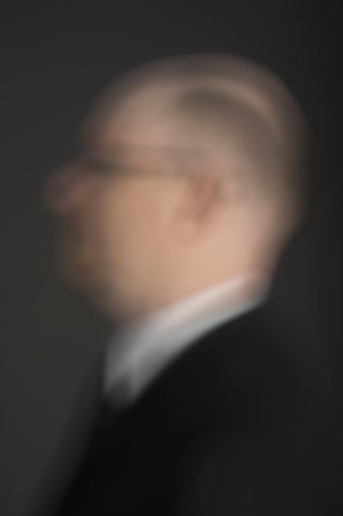
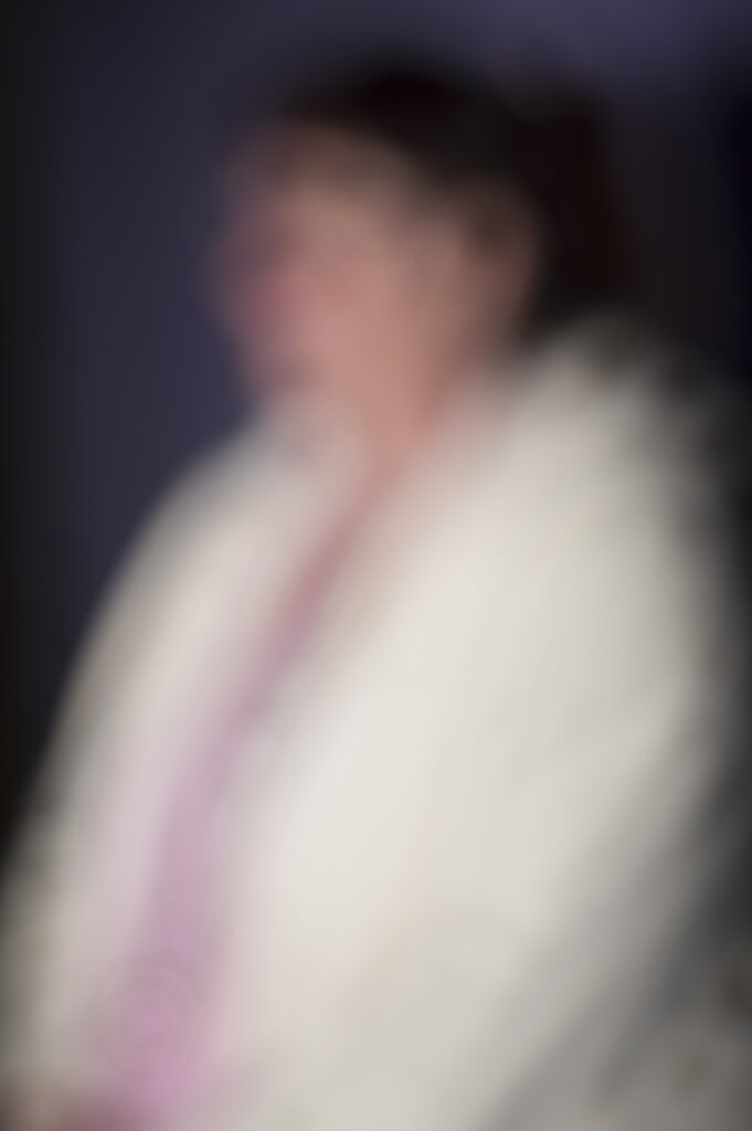
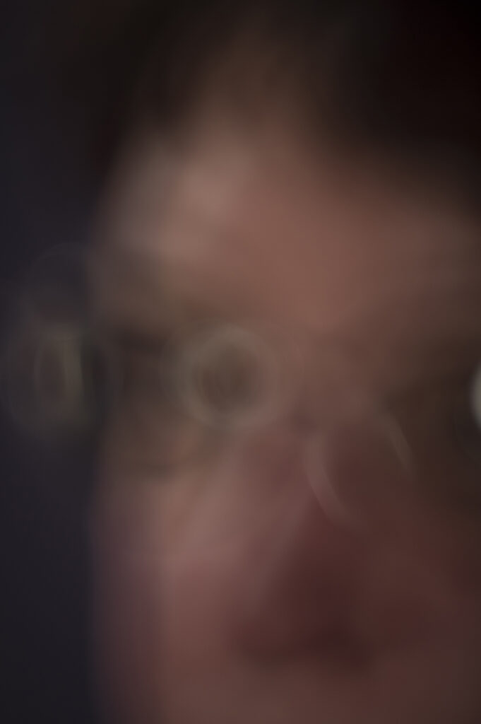
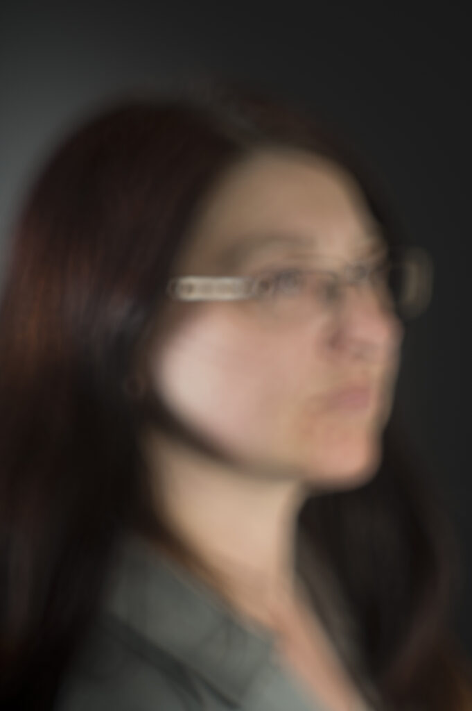
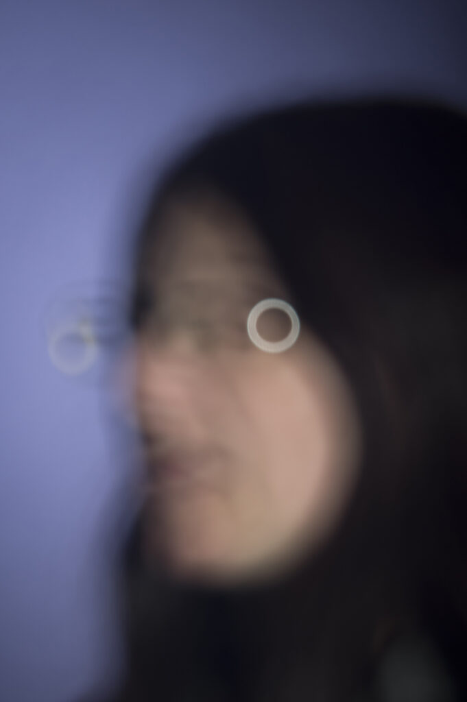
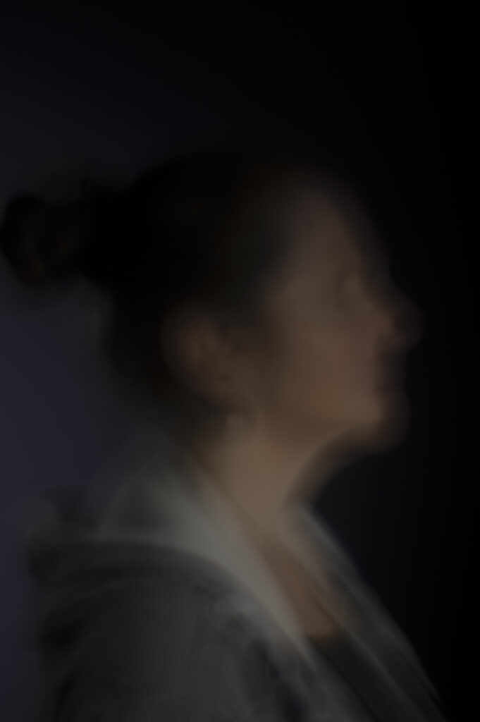
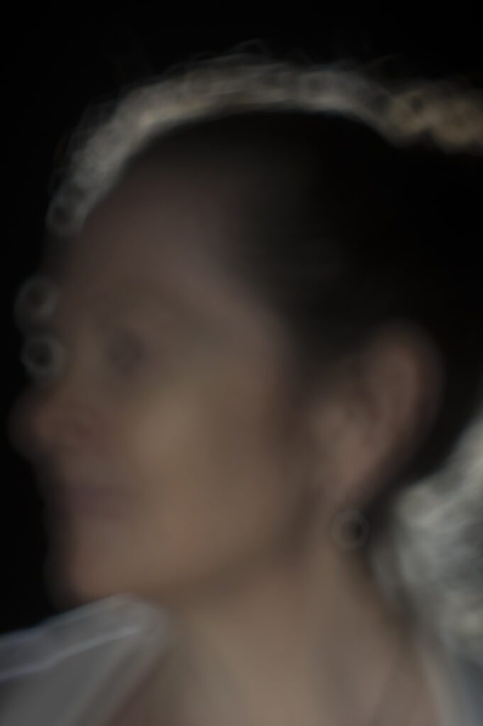
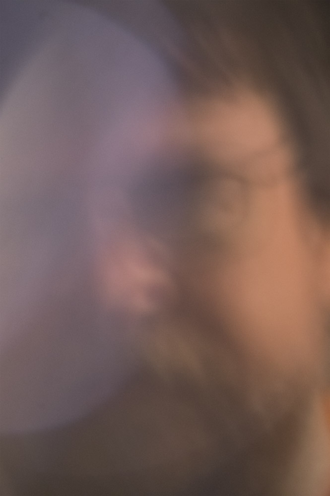
Its a funny thing when you look at a photo and know that it hasn’t worked, but nevertheless still love it and that’s what has happened here. I really like the results, but they mostly aren’t quite right for what I’m doing. The general consensus was that if my idea is to push the boundaries of portraiture then I really need to go to the limits and not play it too safe. The first shot of KRin was judged to be the most successful in this regard. They also reiterated the need to respect the other conventions of portraiture in terms of posing, lighting and dress. So my next step will be some very formal portraits and also some couples or family groups. Time to step the glamour up a bit (and reduce the focus even further).
The last few weeks have been a fairly stressful time for the Art Major students at PSC. The part timers have been struggling with a full time workload and we have all been torn between the need to experiment so we can work out what the hell we are actually on about, and the hard fact that we need to produce a completed, coherent folio at the end of first semester.
We were given some assignments to help us work out what we were doing but despite the enthusiasm of the lecturers they were less than useful for a lot of us. Seems some people respond better to these exercises than others. Wow, people are different, who knew? Actually there seems to be very little recognition of this in the course as a whole and you’d swear that they think that all artists are the same and think the same way.
Anyway…. After a few false starts my folio concept for this year (not just this semester as in previous years) revolves around questioning the photographic portrait and why it has become such a regimented thing. The easy way to explain this is to look at the diversity of styles in the Archibald Prize for painted portraits and then have a look at the National Photographic Portrait Prize where there seems to be a much narrower range of expression.
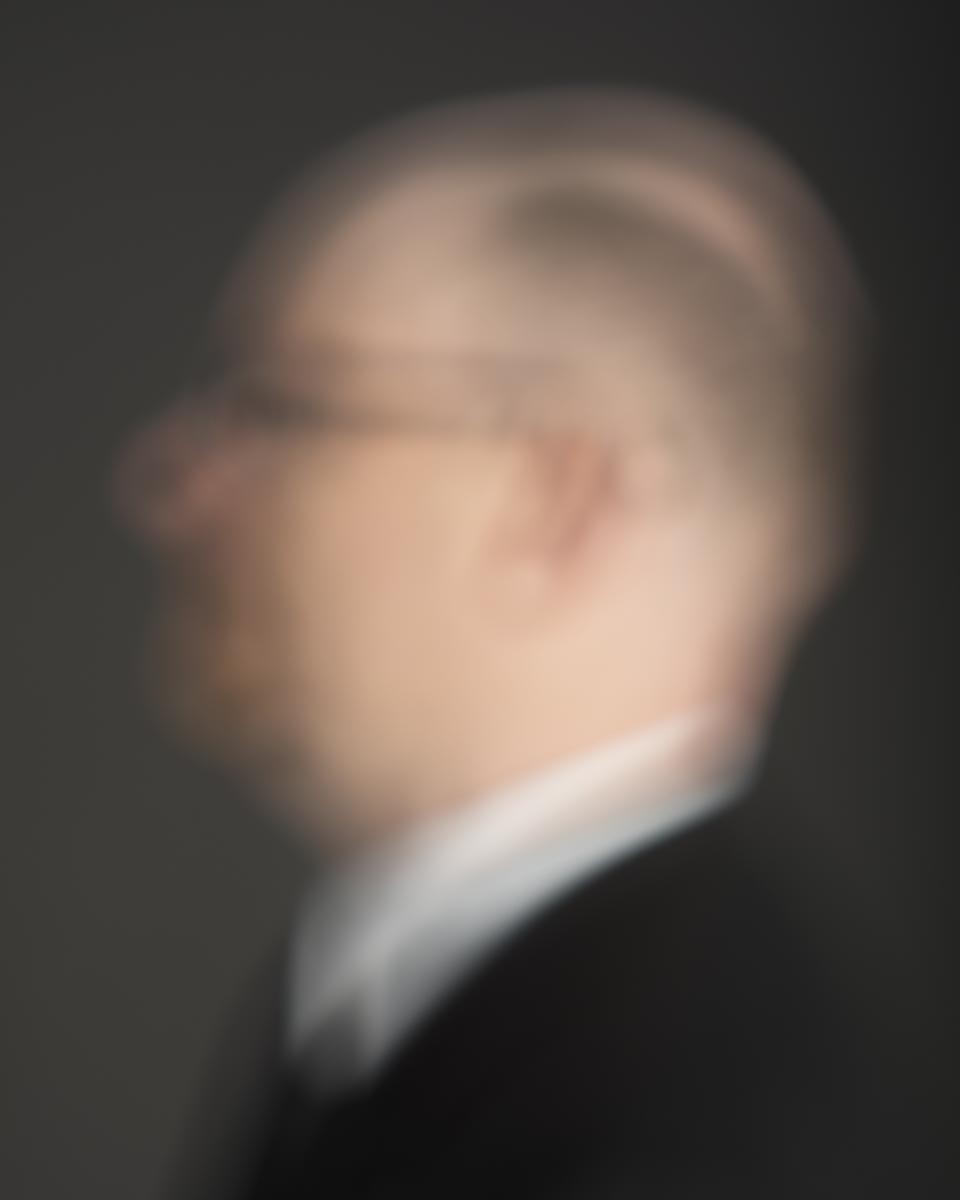
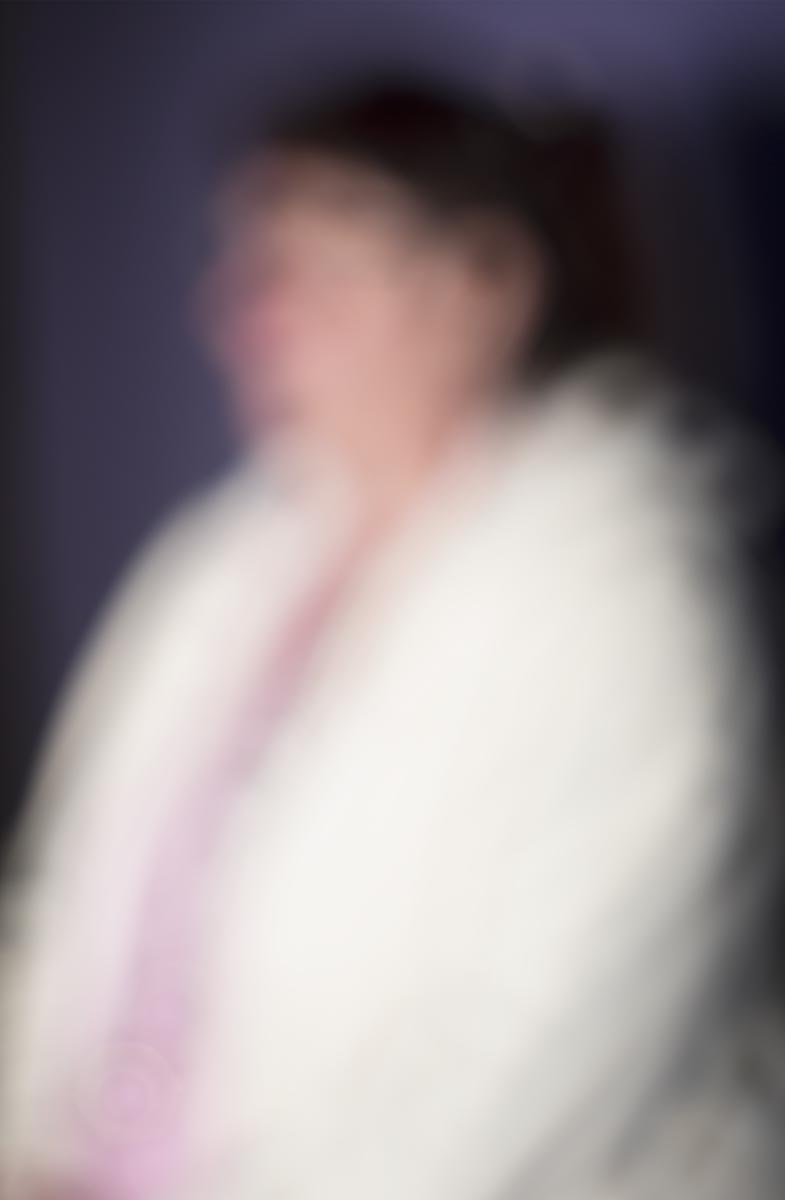
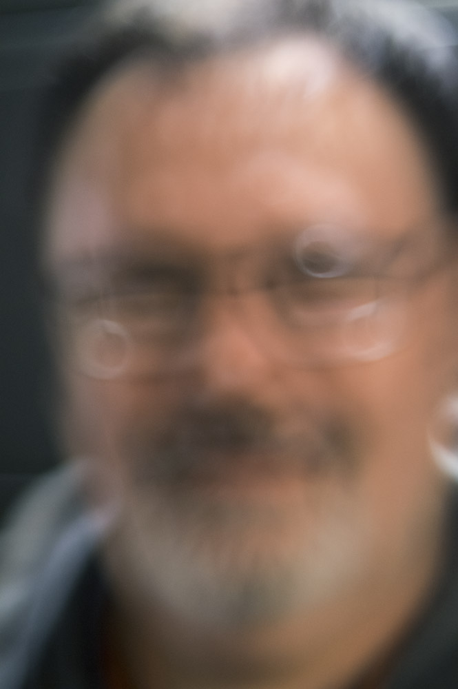
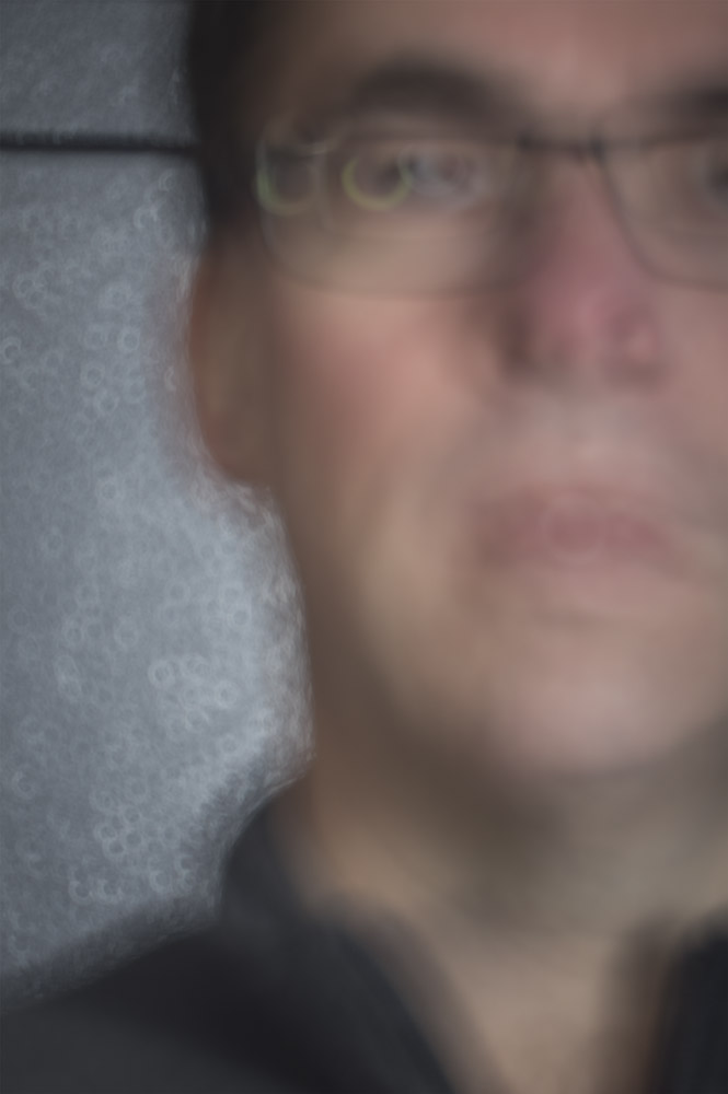
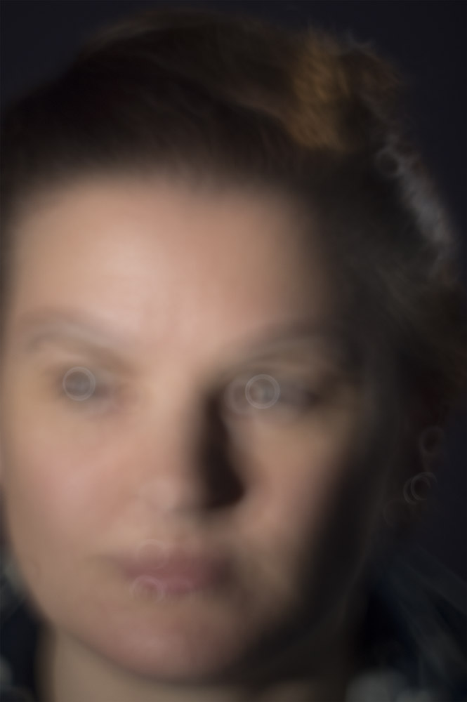
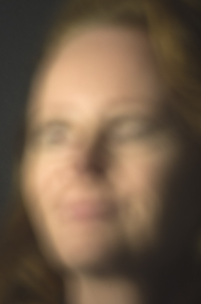
To start with, and it is just a start to this investigation, I have looked at sharpness which seems to be a key requirement for a photographic portrait. A little bit out of focus is a cardinal sin in photography since it indicates sloppy technique. But what if everything is out of focus? How far must you got to make it look like it was deliberate and then how far can you go before it is too far out of focus? Lots of questions and no clear answers yet, if ever. As always there was a last minute rush with these, mainly because I was still wrestling with technique. None of these are manipulated afterwards, it is pretty much straight how it came from the camera other than the usual exposure and colour adjustments that all photos get. I’m not even sure whether it would be feasible to reproduce this technique in Photoshop since there is more than just blurring going on.
Another new thing with these is size, something that becomes critical at this stage. The last two were printed to almost A0 size (841 x 1189mm) as an experiment since the general consensus was that they need to be large. Fortunately you can get really cheap large prints at Officeworks on plain paper so it didn’t break the bank, but come the end of year exhibition and they will all have to be done on a proper printer with expensive paper.